I don’t know about you, but one of the first things I look at when buying a pen is definitely the nib and I hope we can all agree that the nib is the heart of the pen and and plays an important role in the overall appearance of a writing instrument. Now, whether you want to admit it or not, a beautiful nib decoration will not only elevate your pen, but your entire writing experience.
Today I’d like to introduce you to five beautiful nib designs that will probably go down in history as the most iconic. Classic or bold, each of the nibs below exudes tradition, craftsmanship and ingenuity. Let’s discover them together!
Montblanc
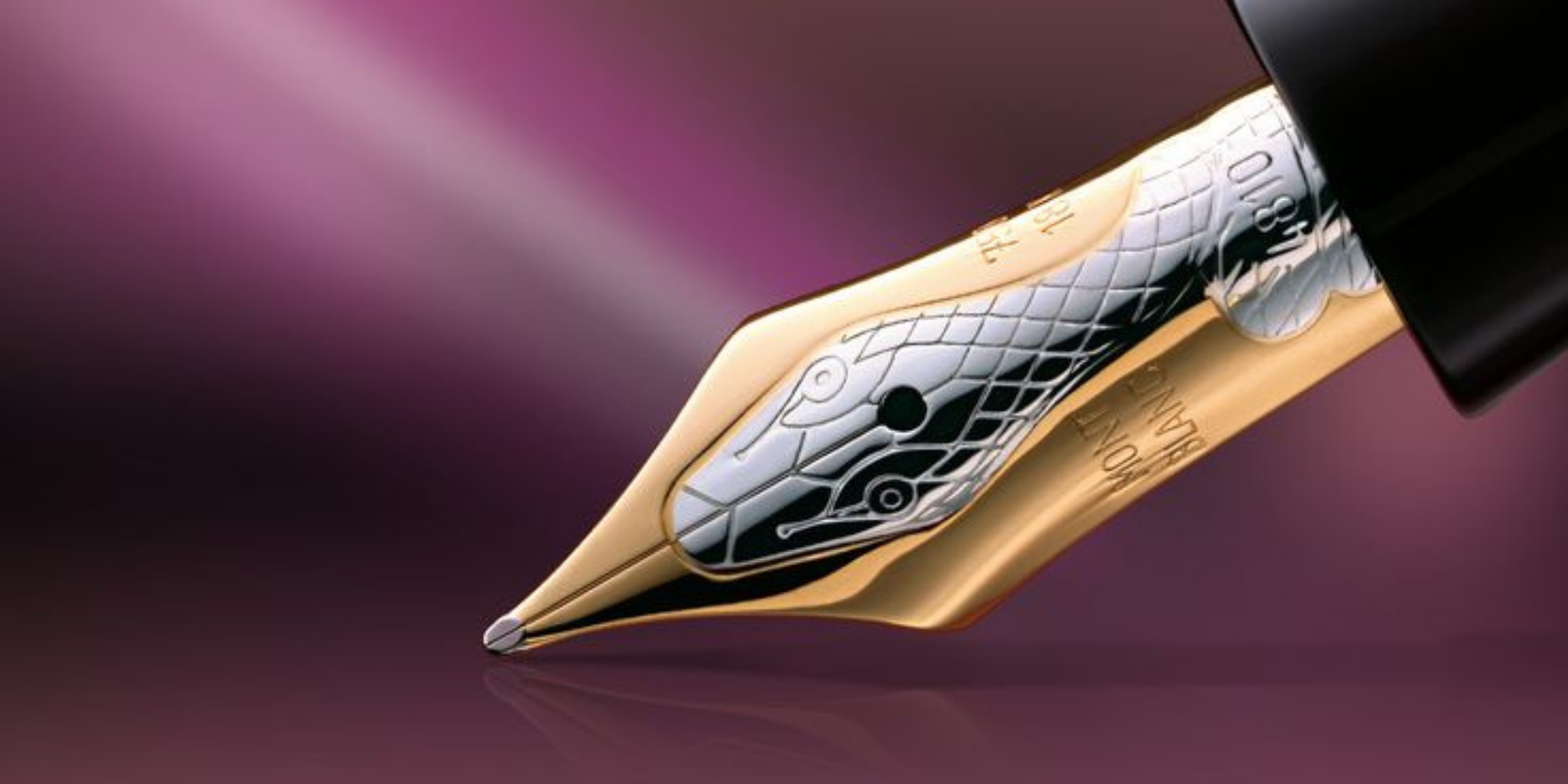
If we were to compare vintage Montblanc nibs with the more recent ones, we see that the latter have been beautifully refined and restyled while preserving the elements that have established the brand. Easy to spot from miles away, a classic Montblanc nib is by far one of the most beloved and recognisable on the market, but today we turn our attention to a truly special nib in their portfolio and it’s about the famous “snake nib” of the Montblanc Agatha Christie Writers Edition 1993.
Graf von Faber-Castell
I have to admit, there’s something regal about Graf von Faber-Castell nibs and I’m talking about the ones that equip the pens in the guilloche and classic series. However, the nib on the Intuition Platino Wood Grenadilla is the most beautifully decorated of all. We don’t know why the German brand didn’t use the same nib design for the Classic Series models, but maybe they will consider doing so with other models.
Montegrappa
Montegrappa has accustomed us to different decorations of their nibs over the years, but the one that has the most charisma and seems so specific to the Italian brand is the nib design of the Extra 1930 models embellished by a finely engraved Greek fret pattern.
Visconti
When it comes to Visconti, you probably already anticipate which nib we’re referring to. It’s the one on the Homo Sapiens models is decorated with a symbol which looks like fleur-de-lis. Also very distinguished and iconic for Visconti.
Sailor
While many would say that aside from the anchor logo that differentiates the Sailor pen from Montblanc’s the two designs are quite similar, I can’t agree. Indeed, there are some slight similarities, but the difference in appearance is noticeable and the two can’t be confused, in fact Sailor stands out in a unique way with both the fine engravings and the slimmer silhouette of the nib. In my humble opinion, the beauty of the Sailor nib is characterised by simplicity and subtlety and those who appreciate that will always consider a Sailor fountain pen.
We use cookies on our website to give you the most relevant experience by remembering your preferences and repeat visits. By clicking “Accept”, you consent to the use of ALL the cookies.
This website uses cookies to improve your experience while you navigate through the website. Out of these, the cookies that are categorized as necessary are stored on your browser as they are essential for the working of basic functionalities of the website. We also use third-party cookies that help us analyze and understand how you use this website. These cookies will be stored in your browser only with your consent. You also have the option to opt-out of these cookies. But opting out of some of these cookies may affect your browsing experience.
Necessary cookies are absolutely essential for the website to function properly. These cookies ensure basic functionalities and security features of the website, anonymously.
Cookie
Duration
Description
cookielawinfo-checkbox-analytics
11 months
This cookie is set by GDPR Cookie Consent plugin. The cookie is used to store the user consent for the cookies in the category "Analytics".
cookielawinfo-checkbox-functional
11 months
The cookie is set by GDPR cookie consent to record the user consent for the cookies in the category "Functional".
cookielawinfo-checkbox-necessary
11 months
This cookie is set by GDPR Cookie Consent plugin. The cookies is used to store the user consent for the cookies in the category "Necessary".
cookielawinfo-checkbox-others
11 months
This cookie is set by GDPR Cookie Consent plugin. The cookie is used to store the user consent for the cookies in the category "Other.
cookielawinfo-checkbox-performance
11 months
This cookie is set by GDPR Cookie Consent plugin. The cookie is used to store the user consent for the cookies in the category "Performance".
viewed_cookie_policy
11 months
The cookie is set by the GDPR Cookie Consent plugin and is used to store whether or not user has consented to the use of cookies. It does not store any personal data.
Functional cookies help to perform certain functionalities like sharing the content of the website on social media platforms, collect feedbacks, and other third-party features.
Performance cookies are used to understand and analyze the key performance indexes of the website which helps in delivering a better user experience for the visitors.
Analytical cookies are used to understand how visitors interact with the website. These cookies help provide information on metrics the number of visitors, bounce rate, traffic source, etc.
Advertisement cookies are used to provide visitors with relevant ads and marketing campaigns. These cookies track visitors across websites and collect information to provide customized ads.


Leave a Reply