Can you imagine a more inadequate combination of colours on an object then violet, orange, blue, green and yellow? Sounds more like a colour combination for a clown costume, right? Well, Sir Paul Smith sees it in a slightly different way. To say it with his words: “classic with a twist”. Let me give you some insights within the collaboration between Caran d’Ache and Sir Paul Smith and why this is relevant even outside the world of writing instruments.

The start
Sir Paul Smith presented his first own collection back in 1976 in Paris and as you can imagine by the images in this post, it was a MEN collection. It took him another 17 years before he presented his first collection for Women, in 1993. However, one thing was a constant in Paul Smith’s history; the stripes! Stripes were always a distinctive sign of his collections and this really never changed until today.
As one of the most eclectic stylist in the world but without any doubt as well as one of the most iconic British designer, Paul got a knighthood in 2000 in honour of his work. He is one of only 2 fashion designer to receive such an accolade. This tells already a lot about Paul Smith’s charisma and ability to combine the incompatible. You remember the colours in the introduction?

The “Artist Stripe”
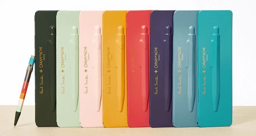
The launch of the Fall/Winter ’16 collection was a real firework since Paul Smith launched the color scheme called “Artist Stripe” which combines 8 pastel colours in a way that only a real artist could do. Inspired by expressive art, the colours are positioned in a way that highlights the center of the object on which they lay and are conveying a sense of harmony that are typical from paintings of Franz Marc or August Macke. The scheme is so “universal”, that today you can find numerous objects (even an entire store) with this colour scheme on and, guess what, they just look great as you can judge by yourself.
Yes, I know, again a Porsche 911, isn’t it? I know what you are thinking. But this is a pure coincidence. Paul Smith is an enthusiastic car collector, and after a Mini Cooper and a Land Rover Defender, they decided to mark THE sports car “par excellence” with their “Artist Stripe” motive: a fabulous 1965 Porsche 911 2.0. As a purist, the first time I saw this car at the Le Mans Classic in 2018, my first reaction was: WHAT THE HELL IS THIS??
But you know what? After observing it racing, and watching again and again to the pictures that were continuously posted by some very high-profile accounts on social media, including Porsche itself, and after reading quite a bit about this project realized in collaboration with James Turner, co-founder of Sports Purpose and Richard Tuthill of Tuthill Porsche, I quite like the idea and finally the car. These colours, all very IN in the sixties, make this car a real eyecatcher without being pretentious.


The collaboration with Caran d’Ache
Caran d’Ache and Paul Smith share a passion for colours, I think we can assert this without being trivial. Founded in 1915, Caran d’Ache has produced ever since high quality colours and writing instruments. So for their 100th anniversary, in 2015 they asked Paul Smith to select 100 colours to create a jubilee box for the iconic 849. Paul Smith’s fondness for ballpoint pens, in turn, is easy to explain; the company’s own “Goliath” refill writes and writes and writes, the ink should last for four to six kilometres. This corresponds to the work ethic of the British designer.

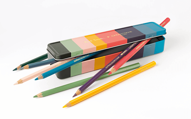
For the third installment of this special design collaboration, Paul Smith adds his Artist Stripe to the Caran d’Ache’s 849 ballpoint pen and a set of water-soluble colour pencils. Perfect as a gift to welcome a new employee or to celebrate an anniversary of service, the 849 is real eyecatcher, just like the car by the way. In todays offices, that are almost “aseptic” from my point of view, this object gives the right touch of color. On the other side of the range, the Supracolor® Soft pens with their soft leads with a diameter of 3.8 mm are nevertheless very robust and are suitable for extensive works. The Swiss love to work extensively, don’t they?! The hiding power of the colour shades and a high pigment concentration ensure their long service life. The drawings can be painted or blurred with the finger, textured by rubbing the lead on sandpaper or even painted in watercolours. Supracolor® Soft pens are designed and manufactured in the Geneva workshops of Caran d’Ache and are therefore the pinnacle of water-soluble colour pencils.


The conclusion
I could go on forever with this article and the thousands of details behind Paul Smith’s creations but someone told me once, that you people rarely read posts that take more than 5 minutes to read, therefore let me invite you to check out the various objects created by Caran d’Ache and Paul Smith since those are not only very collectible items for ourselves (such as the collector box from 2016 that you can see below), but also incredibly appreciated gifts where you don’t spend a fortune and the presentee will remember your gesture for a long time. Because, keep in mind, a Caran d’Ache “Goliath” writes for four to six kilometre, so almost forever.


Leave a Reply